
 |
Cadet | The Dojo | Arm,
lvl1
heavy artillerist |
| Energy | 1877 | Weapon1 | Slowed Anac. cannon |
| Metal | 193 | Range | 300 |
| Armor | 450 | Damage/sec | 20 |
| Buildtime | 2700 | ||
| Maxvelocity | 1.6 | ||
| Turnrate | 1003 | ||
|
Special |
n/a |
|

![]()
Buildpic: The unit angle and position are very good, but it is too dark and too messy in the chest area. However, the barrel seem to be exellent illuminated [2]. The background is pretty, it's just a shame that the lake in the background looks pink... [2.5]. Now the merging is a bid odd. The unit have shadows on the ground falling to the right while the small hill in the background seem to be illuminated from the front. Such heaven that you have installed here should at least in the theory illuminate things very bright [1].
Buildpic: 5.5
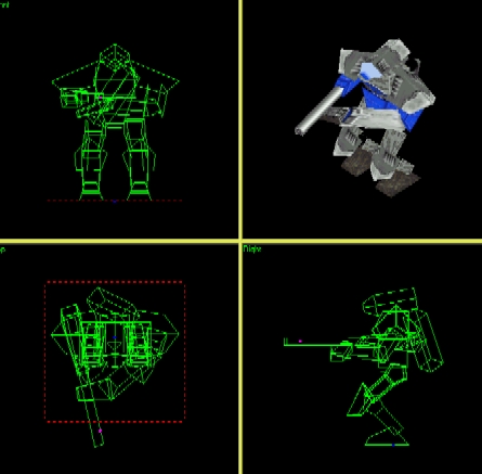
Model: This model somehow links me to Honda's humanoid bot with the always bent knees and backpack. The gun however forces me to return to the review. Now, the useless faces have been pretty good covered up, but there's still a bunch left awaiting. You must first of all remodel the cannon because 22 faces are not acceptable for such simple basic design. It is possible to cut it to more appreciated 7 without loosing any in-game details at all. Then there is a bunch of those pesky little things underneath the head (that in my opinion is a bit too long) and in and under the hand [2.5]. The texturing is mostly shameful. You see, just because you use many similar textures close to each other they won't look better. In fact they would look messy and mostly undistinguishable from each other and this is the current case. The shoulders, the head, the legs and the arm all uses same or similar textures and it looks most horrific in game, I can assure you. The backpack would also look better if you could distinguish it, which in current pisition is rather hard [1]. The corpse looks half-wrecked. The torso and the arm have been left mostly intact (and still remains in a very upright angle) while the legs have been changed into a fragment soup of small faces, I as thought first. The problem is that the "faces" really are small cubes with 5 faces each and that way take up a horrific ammount of 105 faces (not to meantion that all are in same texture). I don't want to give you zero points for the mess, but you haven't deserved the single point either [0.5].
Model: 4
Script: The script is good, somehow reminding me of the Morty lumping.
Script: 10
Balance: This unit is so obsolete that it ain't even funny. The Hammer that can be built in the same lab have longer range, more than twice the damage/second ratio while it costs less, got almost double as much armor but is a bit slower. If you removed the weapon slowdown in the scrip and lowered the armor with about 70-90 units, you would get a kbot that is more effective, yet much more vulnerable than the Hammer.
Balance: 0
My score: It doesn't look good enough for me. A grey blob wandering over the screen and the fact that it is outmastered by the Hammer don't really make me feel better about it.
My
score: 0
| Total Score: 3.9 |